


Problem:
Users come to the National Park Service website because they are looking to visit a national park and are interested in learning more about the national parks foundation. The users main goals are to find a park they want to go to and to plan the activities they can do while visiting.
Goal:
To reorganize the information architecture structure, create new style guide and create a more engaging/helpful user interface.
1. Research & UI Analysis

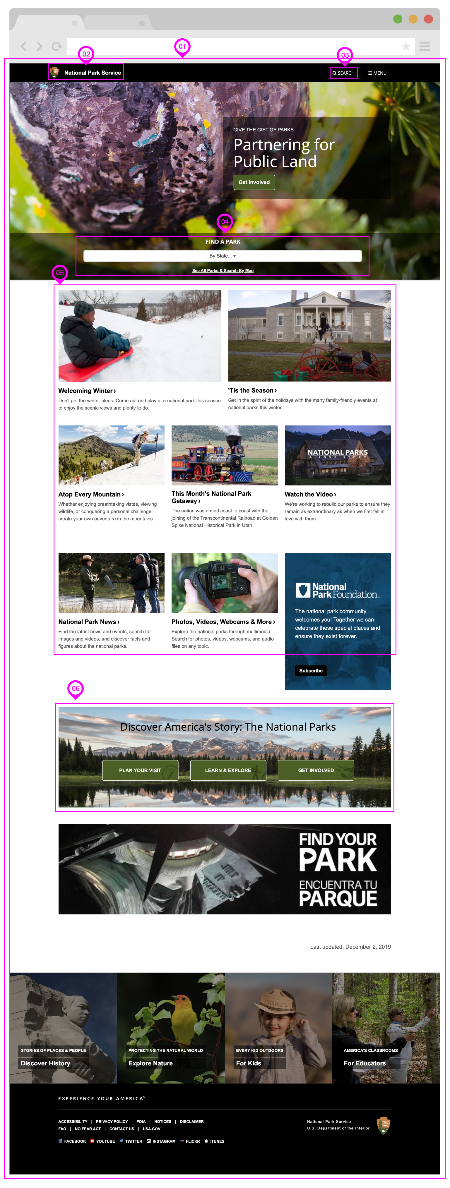
User wireflow through existing NPS website.
Path a user takes:
Find a Park
Search for Glacier National Park
View Glacier National Park info page
Look for Trip Ideas
Search for Glacier National Park Trip Ideas
View Glacier National Park Hiker Trip Idea

Proto persona

Color accessibility test for the home page hero image copy.
Usability Test Plan
Goals + Objective
We want to understand what the current issues are with the website for the National Parks Service. It is known that the site is not particularly intuitive but we want to see specifically what users find confusing and how the site makes them feel. This will enable us to find key features we should redesign.
Task 1: Search for Glacier National Park
Task 2: Reserve a Campground
Task 3: Look at Trip Ideas and Pick One that Interests You
Testing Questions:
How did you feel when you were going through the site?
What are you most interested in when going through the site?
Did you find that there was too much info or was it helpful?
Did you feel overwhelmed at any point when going through the site?
If there was one thing you would change, what would it be?


Priority Matrix and user feedback analysis from test results.

2. Information Architecture + Navigation Prototype

Website Navigation Heuristic Analysis - main navigation.

Website Navigation Heuristic Analysis - footer.
Website Navigation Usability Test
GOALS & OBJECTIVE
We want to understand what the current issues are with the navigation of the National Parks Service website. We already know that the site is not particularly intuitive but we want to see specifically what users find confusing and how the site makes them feel. This will enable us to find key features we should redesign.
Task 1: Find info about job opportunities.
Task 2: Find where you can purchase a park pass.
Task 3: Find what partnership opportunities there are.

User insights from the navigation usability test.
Card Sorting: Part 1
Primary, Secondary and Footer Navigation.

Card Sorting: Part 2
Orange:
Original pages
Green:
Categories/new main nav
Yellow:
Renamed pages

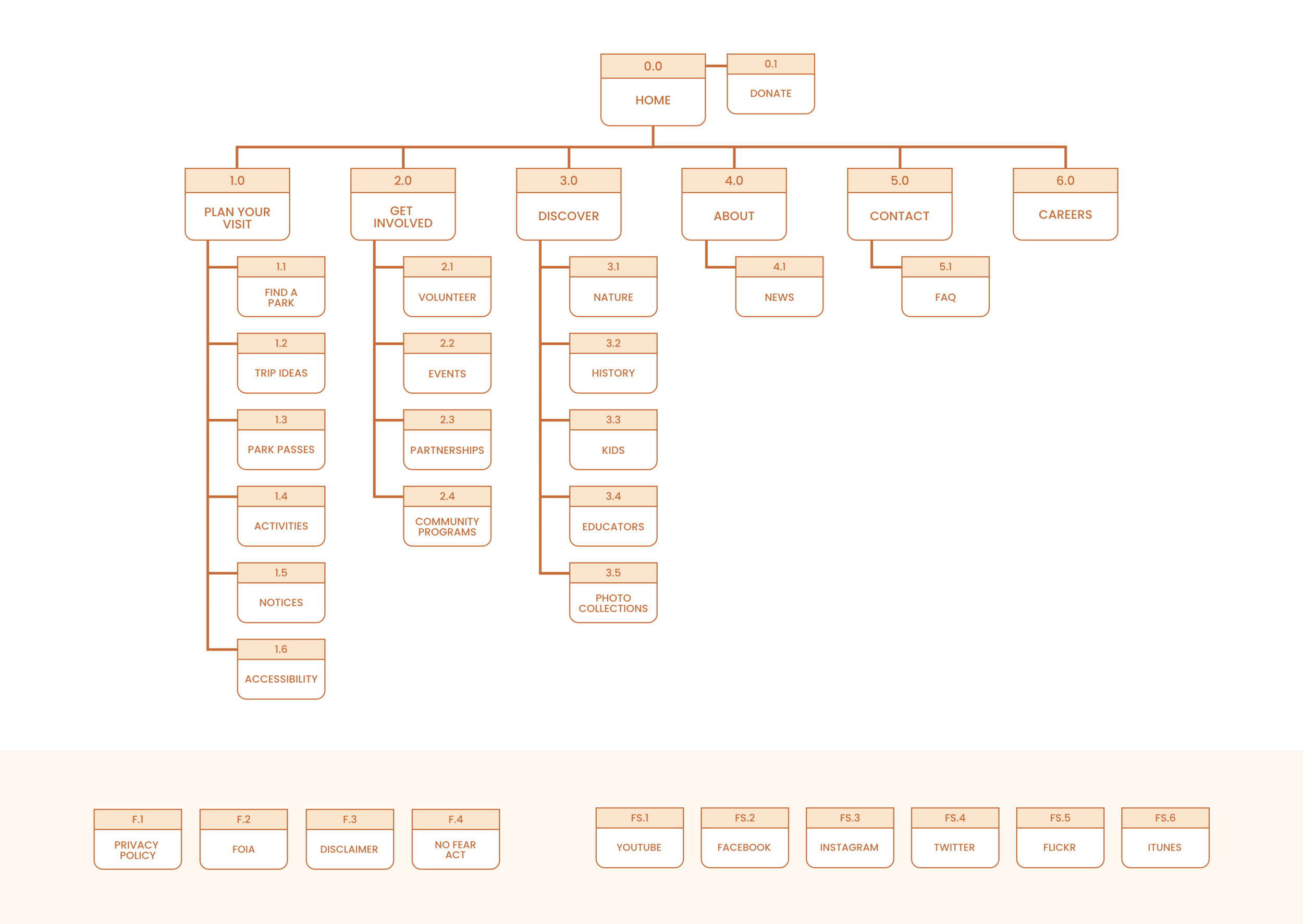
While organizing the sitemap, I realized that a page could be combined to minimize the number of links and a few more names should be changed.
Combined:
Topics > Discover
Name changes:
Passes > Park Passes
Search by Activity > Activities
Explore > Discover
3. UI Design + User Testing

Lo-Fi Wireframes

View full low fidelity prototype here.
5 Second Tests
Test Questions
What is the purpose of the page?
What are the main elements you can recall?
Who do you think the intended audience is?
Did the design/brand appear trustworthy?
What was your impression of the design?
Test Findings
Home page hero search bar:
Have categories to choose from to filter your search, rather than an open ended search bar.
For example: Climate - desert, mountains, forest, wetlands.
The pastel colors are nice and calming - which is the first thing when I think of parks. You go there to escape the world and enjoy nature.

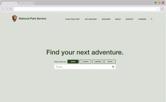
4. Wireframe + Prototype
UI Brand Style


High Fidelity Wires


View full high fidelity mobile prototype here.


View full high fidelity desktop prototype here.
5. User Testing
Hi-Fi Mobile Prototype Usability Test Plan
GOALS & OBJECTIVE
This test will help uncover any areas of the Hi-Fi website prototype that aren’t intuitive in the redesign of the National Parks Service website. The goal is to find what users find confusing and how the site makes them feel. This will help discover if it’s difficult to navigate the site and uncover any tasks that may cause the user frustration. Once feedback has been received, features and/or usability will be iterated on.
Task 1: Search for Texas National Parks.
Task 2: View the ‘Plan Your Visit’ page.
Task 3: Find the list of available park passes.
Testing Questions:
What were your initial thoughts when viewing the home page?
How did you feel trying to navigate through the site?
What are you most interested in when going through the site?
Did you find that there was too much info or was it helpful?
Did you feel overwhelmed at any point when going through the site?
If there was one thing you could change, what would it be?

Final Thoughts & Future Opportunities
Enhance User Experience: Focus on improving navigation and accessibility, ensuring the website is user-friendly for all age groups and abilities. Incorporate interactive maps and virtual tours to help visitors plan their visit more effectively.
Mobile Optimization and App Integration: Given the increasing use of mobile devices, ensure the website is fully responsive and optimized for all screen sizes. Consider developing a companion mobile app that could offer features like offline maps, trail updates, and augmented reality experiences.
Sustainability and Education: Leverage the website as a tool to promote conservation efforts and educate the public about the importance of preserving natural landscapes. This could include interactive educational sections, live webcams of wildlife, and features on the ecological impact of human activities in park areas.